genasis
A mobile application where volunteers are paired up with seniors in order to accompany or assist them with a task.
Overview
Scope: User Research, UI/UX Design
Tools: Figma
Team Grape Soda: Brianna Fredeluces, Keith Lim, Deepika Vuppala, Mandy Wu
Duration: May 20, 2021 - May 27, 2021
Background
Senior citizens (60+) are a vulnerable population due to factors like health issues, living conditions, and the current sociopolitical climate of our country. Particularly, since the start of the pandemic, AAPI senior citizens have been targeted and attacked in their own neighborhoods. As a team consisting of Asian-Americans, we all have grandparents who are vulnerable in the current climate, but we live too far to play an active role in their lives. In reality, senior communities often lack a lively and interactive younger demographic.
One potential solution is intergenerational housing. Despite its many mutual benefits, this option may not be practical—let alone available—for the younger generation. An alternative approach is volunteering. Big or small, interacting by supporting the community can still improve the well-being of both parties. Through volunteering, we can cultivate an integrated intergenerational community to lean on, forging a sense of security to improve the lives of both the young and old, especially those who lack a strong support system.
Problem Statement
While AAPI was our main consideration, we expanded our statement to accommodate all seniors who would benefit from such a solution.
In order to cultivate a safe and social community, how can seniors seek support from the younger generation?
Solution
A resource where seniors can request for a volunteer, potentially between the ages of 14 and 30, who can either: (1) accompany them with an activity e.g. a walk in the park, or (2) assist them with a task e.g. a helping hand at the grocery store.
This will not only help with practical and physical labor but improve the social relationship between young and old demographics.
Due to time constraints, we didn’t implement the volunteer side of the app, but we hope we can create this in the future.
Personas
We created two personas that would benefit from using our resource. One involves a senior who would like someone to accompany them when going to the grocery store because of the social climate of the U.S. surrounding Asian Americans and Covid-19. The second involves a senior who would like someone to walk and talk with them.
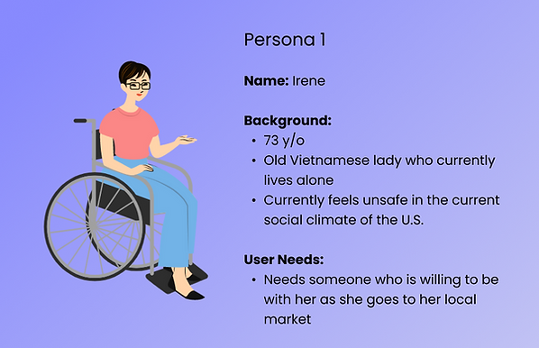
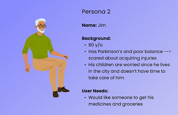
Storyboard
The first thing we did as a team after identifying personas and proposing the possible needs each of them would probably have was to come up with some practical scenarios in which our application would best be used.
Storyboard 1
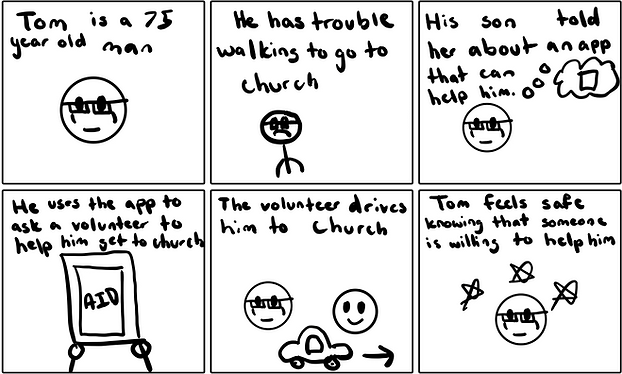
This storyboard illustrates a situation where our app can be used to find someone to help elders to cross the road and make them feel safer in an environment of unrest. They will be able to feel safer being with someone they can trust instead of being by themselves.
Storyboard 2
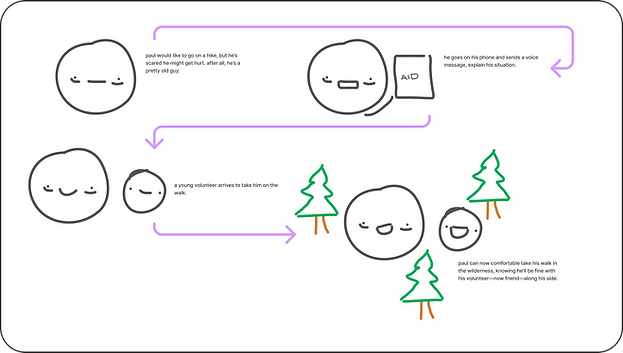
This storyboard shows that the app will be able to provide help not just to accompany elders, but also to assist them in case they have an emergency for not just daily activities, but also just as a means to bridge the generational gap of communication.
Storyboard 3
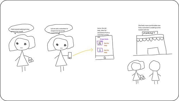
This storyboard illustrates that it is possible to get help through the application for daily activities such as getting groceries because elders may feel scared to go by themselves.
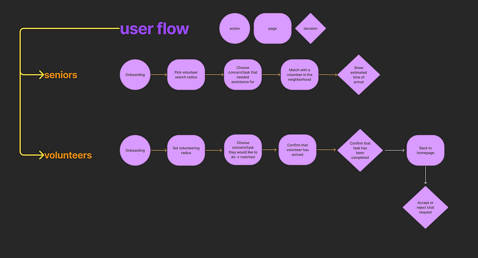
User Flows: Receiving assistance vs Securing a match
Seniors can receive assistance from a local volunteer.
When on their shift, volunteers are matched with a senior within their location radius.
Wireframing
Once we understood what our intended user flow for the application and how to simplify the whole process as much as possible without making sacrifices to the features of the application, we devised a wireframe that demonstrated what the essential functions of the app should be and where they could be accessed. We devised our wireframe to appeal to both the users getting help (seniors) and the users offering help (volunteers), and made sure to integrate both aspects of their user flow into the wireframe. This resulted in the Figma example below, where we made a text-based skeleton of what our app would be. Previous experience from each of our team members made the process simpler, as we already had a rough idea of where everything should be.
Brand Design
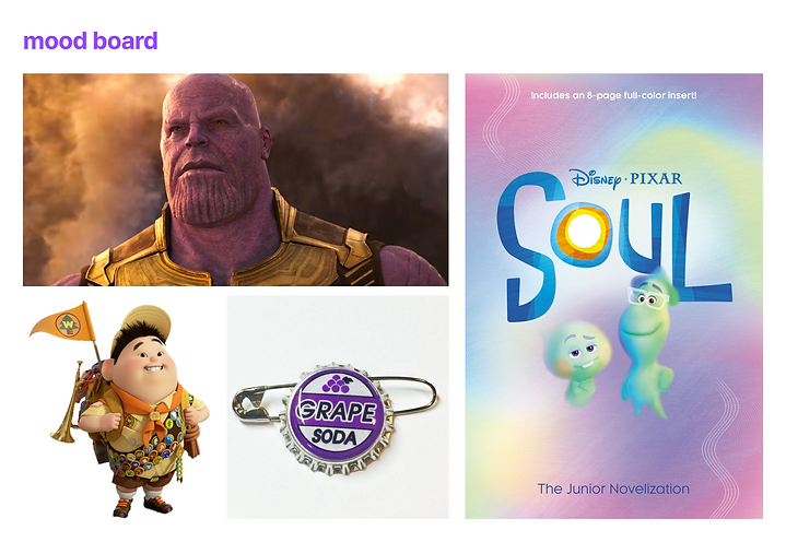
Since we named our team Grape Soda as a reference to the Pixar Movie Up, our mood board includes the character Russel and the grape soda pin. Additionally, we included Thanos and a poster of the movie Soul since they also contain the color purple. After some research, we chose the colors shown in the style guide below. The shades of orange represent an optimistic and uplifting atmosphere that we wanted to convey when users choose this application. Not only are the colors a reference to Russell’s joyful personality but the purple is also a reference to Ellie’s grape soda pin that is a main inspiration for our team name. This color scheme represents the uplifting nature of having a volunteer by a senior’s side.


High Fidelity Prototype
With our brand design decisions in place, and the color schemes that we were going to use, it was time to revise the wireframe and actually create our high-fidelity prototype to be used for user testing. We chose our orange color and logo to match up on most of the screens, and the buttons were also arranged using this signature orange color. We added more graphics, and put in example use cases to make it obvious what we were trying to achieve in terms of the overall aesthetic of the application. We also made sure to make everything that needed to be easily accessible rightfully so, because we knew that the elderly would likely need large font sizes and clear buttons to direct them to what they wanted to do.
Final Results
My team went on to place 3rd in Design Frontiers. Design Frontiers is an annual design sprint at UC San Diego where teams develop prototypes to solve real world problems. It is hosted by Design Co, a student organization, bridging the gap of designers and industry.
Reflection
Since this was my first designathon, I really had to keep on top of all my duties while also making sure not to fall behind in my own school work. I worked with team members who knew even more than I already knew in Figma from previous design projects. Learning a lot in so little time makes me want to keep improving and see what I can do in future designations.
If we have more time, we hope to conduct more user testing, develop the volunteer side of the prototype, experiment with our style guide, and add more features to increase accessibility and improve aesthetics. Some of the features include voice-to-text function, multiple languages, and sounds. We also hope to explore this solution on desktop devices.